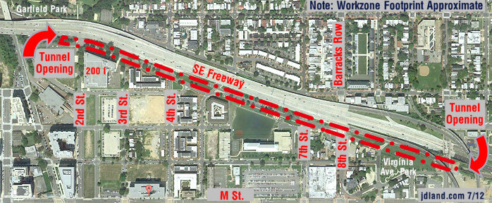
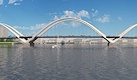
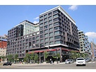
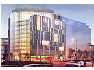
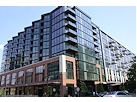
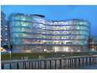
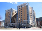
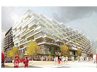
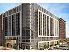
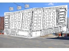
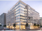
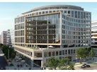
I'm well aware that the home page of this site is a bit, well, dense. There's a lot of information on Near Southeast to get across, and it's not easy to do it in such confined quarters. I'm not sure whether this really helps or not, but I've made the main map a bit showier--now, as you move your cursor, you'll see at top brief summaries of the various projects, and a small (very small) illustration at the top right. (I'm using photos if the development is well on its way, architect renderings if a project is on the boards or just started, and icky photos of what a lot currently looks like if I can't get the developers to hand over any drawings.) Start moving your cursor around, and see what happens.