
|
| |||||||||||||||||||

|
Please note that JDLand is no longer being updated.
peek >>
Near Southeast DC Past News Items: Sep 18, 2009
- Full Neighborhood Development MapThere's a lot more than just the projects listed here. See the complete map of completed, underway, and proposed projects all across the neighborhood.
- What's New This YearA quick look at what's arrived or been announced since the end of the 2018 baseball season.
- Food Options, Now and Coming SoonThere's now plenty of food options in the neighborhood. Click to see what's here, and what's coming.
![-]()
- Anacostia RiverwalkA bridge between Teague and Yards Parks is part of the planned 20-mile Anacostia Riverwalk multi-use trail along the east and west banks of the Anacostia River.
![-]()
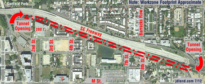
- Virginia Ave. Tunnel ExpansionConstruction underway in 2015 to expand the 106-year-old tunnel to allow for a second track and double-height cars. Expected completion 2018.
![-]()
- Rail and Bus Times
Get real time data for the Navy Yard subway, Circulator, Bikeshare, and bus lines, plus additional transit information. - Rail and Bus Times
Get real time data for the Navy Yard subway, Circulator, Bikeshare, and bus lines, plus additional transit information. - Canal ParkThree-block park on the site of the old Washington Canal. Construction begun in spring 2011, opened Nov. 16, 2012.
![-]()
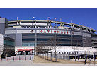
- Nationals Park21-acre site, 41,000-seat ballpark, construction begun May 2006, Opening Day March 30, 2008.
![-]()
- Washington Navy YardHeadquarters of the Naval District Washington, established in 1799.
![-]()
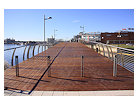
- Yards Park5.5-acre park on the banks of the Anacostia. First phase completed September 2010.
![-]()
- Van Ness Elementary SchoolDC Public School, closed in 2006, but reopening in stages beginning in 2015.
![-]()
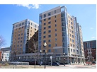
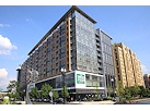
- Agora/Whole Foods336-unit apartment building at 800 New Jersey Ave., SE. Construction begun June 2014, move-ins underway early 2018. Whole Foods expected to open in late 2018.
![-]()
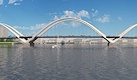
- New Douglass BridgeConstruction underway in early 2018 on the replacement for the current South Capitol Street Bridge. Completion expected in 2021.
![-]()
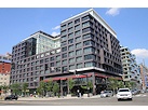
- 1221 Van290-unit residential building with 26,000 sf retail. Underway late 2015, completed early 2018.
- NAB HQ/AvidianNew headquarters for National Association of Broadcasters, along with a 163-unit condo building. Construction underway early 2017.
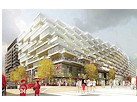
- Yards/Parcel O Residential ProjectsThe Bower, a 138-unit condo building by PN Hoffman, and The Guild, a 190-unit rental building by Forest City on the southeast corner of 4th and Tingey. Underway fall 2016, delivery 2018.
- New DC Water HQA wrap-around six-story addition to the existing O Street Pumping Station. Construction underway in 2016, with completion in 2018.
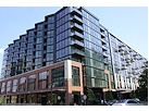
- The Harlow/Square 769N AptsMixed-income rental building with 176 units, including 36 public housing units. Underway early 2017, delivery 2019.
- West Half Residential420-unit project with 65,000 sf retail. Construction underway spring 2017.
![-]()
- Novel South Capitol/2 I St.530ish-unit apartment building in two phases, on old McDonald's site. Construction underway early 2017, completed summer 2019.
![Novel South Capitol]()
- 1250 Half/Envy310 rental units at 1250, 123 condos at Envy, 60,000 square feet of retail. Underway spring 2017.
![-]()
- Parc Riverside Phase II314ish-unit residential building at 1010 Half St., SE, by Toll Bros. Construction underway summer 2017.
![-]()
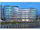
- 99 M StreetA 224,000-square-foot office building by Skanska for the corner of 1st and M. Underway fall 2015, substantially complete summer 2018. Circa and an unnamed sibling restaurant announced tenants.
![-]()
- The Garrett375-unit rental building at 2nd and I with 13,000 sq ft retail. Construction underway late fall 2017.
![-]()
- Yards/The Estate Apts. and Thompson Hotel270-unit rental building and 227-room Thompson Hotel, with 20,000 sq ft retail total. Construction underway fall 2017.
![-]()
- Meridian on First275-unit residential building, by Paradigm. Construction underway early 2018.
![-]()
- The Maren/71 Potomac264-unit residential building with 12,500 sq ft retail, underway spring 2018. Phase 2 of RiverFront on the Anacostia development.
![-]()
- DC Crossing/Square 696Block bought in 2016 by Tishman Speyer, with plans for 800 apartment units and 44,000 square feet of retail in two phases. Digging underway April 2018.
![DC Crossing]()
- One Hill South Phase 2300ish-unit unnamed sibling building at South Capitol and I. Work underway summer 2018.
![One Hill South Phase 2]()
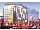
- New DDOT HQ/250 MNew headquarters for the District Department of Transportation. Underway early 2019.
![New DDOT HQ]()
- 37 L Street Condos11-story, 74-unit condo building west of Half St. Underway early 2019.
![37 L Condos]()
- CSX East Residential/Hotel225ish-unit AC Marriott and two residential buildings planned. Digging underway late summer 2019.
![CSX East Residential/Hotel]()
- 1000 South Capitol Residential224-unit apartment building by Lerner. Underway fall 2019.
![1000 South Capitol Residential]()
- Capper Seniors 2.0Reconstruction of the 160-unit building for low-income seniors that was destroyed by fire in 2018.
![1000 South Capitol Residential]()
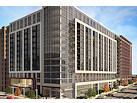
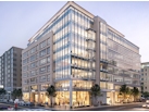
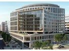
- Chemonics HQNew 285,000-sq-ft office building with 14,000 sq ft of retail. Expected delivery 2021.
![1000 South Capitol Residential]()


2 Blog Posts
If you're actually reading this post on the JDLand home page rather than in your feeds or via e-mail, you're probably noticing that the home page looks a little different this afternoon. After many months (years!) of trying to figure out how to make it not quite so much of an assault on the senses, I finally decided that it's time to move the big ole' development map off the home page.
It was important to have the map back when almost no one had a familiarity with this strange neighborhood known as Near Southeast, but now that the pace of change has slowed considerably, I think it's less necessary to be smacked with that graphic every time one visits the site. You can still reach the map and the tabs with the various projects broken out by type by clicking on the DC-with-an-arrow icon at right; and I've listed a few "Active Projects" to allow quick access to developments that are currently underway or of high interest.
Getting rid of the map also allowed me to make the blog part of the home page much wider, with bigger type, and I think everyone will agree it's now far easier to read. Plus, the Events Calendar is now "above the fold" (as we say in the newspaper biz). I was also able to enlarge the random before-and-after photos that appear at the top of the page, too, which I think is a nice change.
I know some people will be unhappy about the relegation of the map to inside-the-site status, but I do think that, for the next little while, this is a better way to go. As I'm nearing the end of my seventh year running this site, I've got to do *something* to make it fresh to my eyes every so often!
(And you guys even get a bigger box to type your comments in. Everyone's a winner.)
|
Comments (0)
More posts:
JDLand stuff
|
A reminder that on Monday (Sept. 21) the Zoning Commission will be hearing a request from Forest City for a text amendment to the Southeast Federal Center Overlay that would "authorize a Trapeze School and Aerial Performing Arts Center in the SEFC/R-5-E Zone District at the Yards." This is the Trapeze School New York, which left Baltimore's Inner Harbor earlier this year and is currently flying through the air on the old DC Convention Center site at Ninth and H, NW. The school would take up residence on the lot on the southeast corner of Fourth and Tingey ("Parcel O"), which someday will be a residential building but is not expected to be developed anytime soon. It's also just north of the site of the Park at the Yards, which is scheduled to open next year.
Here's the report prepared by the Office of Planning in advance of Monday's hearing, in which they recommend approval of the four text amendments being sought. They're asking for the trapeze school to be allowed for five years (or longer, via a special expection), and to dispense with the off-street parking requirement, since there's already so much surface parking at the Yards. There's also some technical needs to actually create tax parcel lots on the site to allow for the issuance of building permits.
The hearing is at 6:30 pm at 441 4th St., NW (Suite 220 South), or you can watch the live feed or wait for the video on demand (it gives me a smile just to type that--I've waited for video on demand for zoning hearings for so long!)
|
Comments (0)
|